

Lighting Relief Art: Day-and-Night Tips for Textured Walls
Why Light Matters More for Relief Art Than for Flat Prints
Lighting relief art means placing and choosing light so the raised and recessed areas of a textured piece cast clear, readable shadows. That is the whole job, and it is why a relief painting behaves so differently from a poster.
A print is finished the moment it is printed. Light only has to be bright enough to see it. A plaster relief is different, because the surface is the artwork. Ridges catch light, hollows hold shadow, and your eye reads the contrast as depth. Take the shadows away and you are left with a pale, quiet rectangle.
Think of it like a landscape at noon versus a landscape at sunset. Same hills, same trees. At noon, everything looks flat and washed out. At sunset, every slope has a long shadow and the whole scene gains dimension. Your wall can do the same thing.
This is also why product photos can disappoint. A camera flattens depth that your eyes read easily as you walk past. If a listing photo looks calm, the piece in person will usually feel richer, with more movement in the shadows than the picture shows.
The good news is that you don't need a lighting designer. You need to understand three things: where light comes from, how warm or cool it is, and how bright it is. The sections below cover each in turn, following the order your day follows.

How Light Direction Shapes Shadow and Depth
Light direction is the angle at which light reaches the wall, and it matters more than brightness for textured art. Side light stretches shadows and deepens ridges. Light from directly in front flattens them.
Here is a simple way to picture it. Hold your hand flat against a wall and shine a phone torch straight at it. You see skin and little else. Now move the torch to the side, almost parallel to the wall. Every knuckle and wrinkle suddenly pops. A relief painting responds exactly the same way.
| Light direction | What happens to texture | Best used for |
|---|---|---|
| Straight on (front) | Shadows shrink, surface looks flat | General room brightness only |
| Slight angle | Gentle shadows, balanced depth | Everyday viewing |
| Steep side angle (grazing) | Long, dramatic shadows, deep ridges | Evening mood, statement pieces |
| Glare-facing | Reflections, washed-out surface | Avoid |
The angles above are practical rules of thumb, not measured standards.
What does this mean for buyers? Before you choose a wall, notice where your windows sit. A wall that runs beside a window, so light skims across it, will make relief art look alive for hours. A wall that faces a window head-on gets bright but flat light. If that is your only option, a deeper-textured piece will hold its shadows better than a subtle one.
Artificial lights follow the same logic. A ceiling spotlight pointing straight at the wall will wash out the texture, so move the beam sideways if you can. A tiny shift in angle can change the whole feel of the piece.
Morning to Afternoon: Working With Daylight
Daylight changes direction, color and strength across the day, so a relief painting never looks quite the same twice. That is the best feature of textured art, and it costs nothing.
Morning light is usually softer and lower, and it arrives from one side of the house. If your textured wall faces that window, you will see long, gentle shadows early on. By midday the light climbs higher and often gets harsher, which can shorten shadows on a vertical wall. Late afternoon brings the angle back down and often adds warmth, which many owners consider the sweet spot for relief art.
A few practical tips for the daytime:
- Place the piece on a wall adjacent to a window, not opposite it, so light skims the surface.
- Avoid direct sun hitting the artwork for long hours. It can cause glare, and strong, prolonged sun is not kind to any artwork over the years.
- Use sheer curtains on very bright windows to soften the light without losing the shadow play.
- Check at three times: morning, midday and late afternoon, before you commit to a spot.
Try this before you hang anything. Tape a sheet of paper cut to the piece's size onto your chosen wall, then glance at it through the day. If the paper looks flat and blank at most hours, consider a different wall or a deeper relief.
White and cream pieces show daylight shadows most clearly. A piece like the White Minimalist Textured Painting Canvas #P198 brightens a wall and shows its shadows plainly in side light.
Evening Magic: Picture Lights and Wall Lamps
Evening is when relief art can look its most dramatic, because you control the light angle completely. Once the sun goes, a single well-placed lamp can do more for the piece than any window.
Two fixtures work especially well:
- Picture lights mount above the frame and throw light down across the surface. Because the light grazes the wall, it creates long shadows in every ridge.
- Wall lamps or adjustable sconces beside the artwork let you aim the beam across the surface from the side.
Both beat a ceiling downlight pointed at the center of the piece. The strongest evening effect comes from angling the light across the surface rather than straight at it.
Here is an easy test. Switch off the overhead light, switch on one lamp, and walk slowly from one side of the room to the other. You will see the shadows slide and change as you move. That moving shadow is exactly what you get from a handmade textured piece.
Dimmers help more than most people expect. Lower brightness tends to deepen the contrast between lit ridges and dark hollows, which gives a calmer, more gallery-like feel. If you can add a dimmer to a lamp or fixture near the art, do it.
One caution: keep any bulb at a comfortable distance from the artwork and follow the fixture's instructions. Choose cool-running LED bulbs, and never place hot lamps tight against a frame.
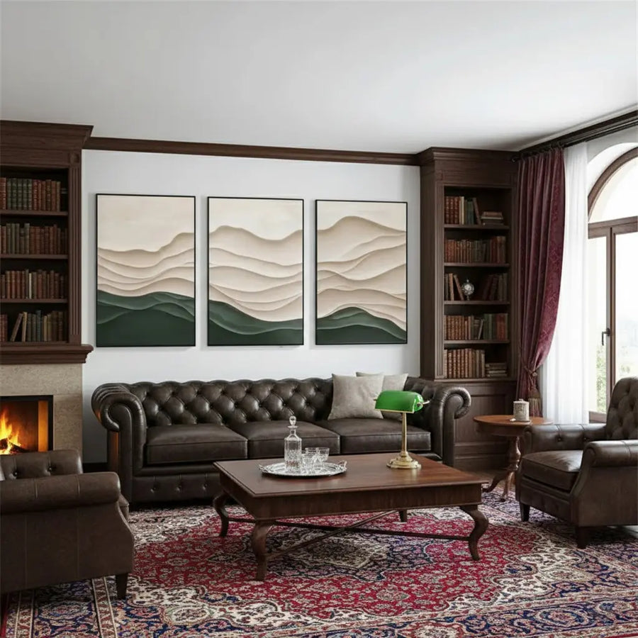
Bulb Color and Brightness: Getting the Kelvin Right
Color temperature, measured in Kelvin (K), describes how warm (yellow) or cool (blue-white) a bulb's light looks. Lower numbers look warmer, and higher numbers look cooler.
Reputable sources agree on the basics. The U.S. Department of Energy explains that warm light sits around 2700 to 3000 K, while cooler light falls roughly between 3600 and 5500 K. It also notes that warm light suits living spaces. ENERGY STAR lists most certified bulbs at 2200 to 3000 K, with whiter options at 3500 to 4100 K and bluer ones at 5000 to 6500 K.
How does that help your wall? Use this as a starting point:
| Piece tone | Bulb suggestion | Why |
|---|---|---|
| White, cream, beige | About 2700 K (warm) | Feels soft and golden |
| Black, charcoal, grey | About 4000 K (neutral white) | Keeps edges crisp |
| Mixed or colorful | About 3000 K (soft white) | Safe middle ground |
The 3000 K middle-ground suggestion is a general guideline, not a manufacturer specification.
Two buying tips. First, shop by lumens, not watts. ENERGY STAR points out that lumens measure light output while watts measure energy used. Second, keep every bulb near the artwork at the same color temperature. Mixing 2700 K and 5000 K bulbs on one wall makes the plaster look patchy.
If your room gets little daylight, choose a piece with deeper ridges. It will hold shadow even in dim light.
Common Lighting Mistakes and Easy Fixes
Most lighting problems with textured walls come down to a handful of habits, and each has a quick fix.
- Aiming a spotlight straight at the piece. Front light shrinks shadows and flattens the surface. Move the beam to the side, or use a picture light mounted above the frame and angled across it.
- Mixing bulb colors. A 2700 K lamp beside a 5000 K downlight makes plaster look patchy. Keep every bulb near the artwork at one color temperature.
- Hanging the piece opposite a window. You get bright but flat light. A wall beside the window lets light skim across the surface.
- Relying on overhead light alone. A single lamp placed low and to the side often does more for texture than the whole ceiling grid.
- Placing hot fixtures too close. Choose cool-running LEDs, keep a comfortable gap from the frame, and follow the fixture's instructions.
If a room still looks flat after these fixes, the piece may simply be too subtle for the light it gets. A black minimalist piece with deeper ridges holds shadow in low light better than a very soft surface. For a specific wall, you can also ask about custom texture depth and tone.

A Simple Day-and-Night Checklist
Before you hang, or if you are rethinking a wall you already have, run through this list:
- Tape paper cut to the piece's size on the wall and check it in the morning, at midday and in late afternoon.
- Note which window sits beside the wall, not opposite it.
- Pick one bulb color for the whole area: about 2700 K for white and beige pieces, about 4000 K for black and grey.
- Add one angled light, either a picture light or a side lamp.
- Add a dimmer if you can, then walk across the room and watch the shadows move.
Browse the full sculptural relief paintings collection to compare surfaces, or explore Wabi Sabi art and 3D plaster art for deeper textures.
Conclusion
Relief art is lit by the room as much as it is made by the artist. Side light deepens ridges, front light flattens them, and warm or cool bulbs change the mood of the same surface. Place the piece beside a window, add one angled light for the evening, keep bulb colors consistent, and let the shadows do the work. Test your wall at three times of day, then choose a texture depth that suits the light you actually have. If you need help matching a piece to a tricky wall, contact the ArtiQuo team.
Frequently Asked Questions
What is the best light for textured wall art?
Angled light is best. A picture light above the frame or a lamp beside it, aimed across the surface, stretches shadows and makes ridges look deeper. Light pointed straight at the wall flattens the texture.
What color temperature should I use for relief art?
For white, cream and beige pieces, about 2700 K feels soft and golden. For black and grey pieces, about 4000 K keeps edges crisp. The U.S. Department of Energy describes 2700 to 3000 K as warm light, which suits living spaces.
Will sunlight damage a plaster relief painting?
Strong sun for many hours a day can cause glare and is not good for any artwork over time. Place the piece on a wall beside a window and use sheer curtains to soften direct light.
Do I need a picture light, or is a lamp enough?
Either works. A picture light gives even, grazing light from above, while an adjustable lamp or sconce lets you aim from the side. Avoid pointing a fixture straight at the center of the piece.
How can I make a flat-looking relief painting look deeper?
Move the light source to the side, lower the overall brightness with a dimmer, and keep bulb colors consistent. If the wall gets little daylight, choose a piece with deeper ridges.