

Wabisabi Art | Textured Handmade Wall Decor
Quick answer: Wabi sabi art is handmade, texture-rich artwork that finds beauty in imperfection and the natural aging of materials. It suits calm, modern homes because its earthy palette and tactile surfaces add warmth without clutter.
1. What Is Wabi Sabi Art?
Wabi sabi art is artwork that finds beauty in things that are imperfect, impermanent and incomplete. In practice, that means uneven plaster, muted earthy colors, visible brushwork and surfaces that look touched by time rather than fresh off a production line.
Think about a chipped ceramic mug you would never swap for a brand-new one. That feeling is the heart of this style. The term combines two ideas: wabi, often translated as subdued, austere beauty, and sabi, which points to a rustic patina that comes with age.
| Wabi sabi wall art | Mass-produced wall art | |
|---|---|---|
| Surface | Textured, tactile, sometimes cracked or uneven | Flat, uniform print |
| Palette | Earthy, muted, natural | Often high-contrast or trend-driven |
| Uniqueness | Every piece differs | Thousands of identical copies |
| Feeling | Calm, grounded, lived-in | Decorative, sometimes generic |
| Aging | Gains character over time | Can look dated or simply worn |
At Artiquo, the idea is simple: pieces are made by hand, and the imperfections are the point. You can browse the full wabi sabi wall art collection to see how that plays out across sizes and palettes.

2. Where Wabi Sabi Comes From: A Philosophy, Not a Trend
You may have seen "wabi sabi" all over Pinterest and assumed it was a new design fad. It is not. The aesthetic grew out of the Japanese tea ceremony in the fifteenth century, and it centers on an awareness that all things change and fade, along with a quiet pleasure in objects that show it.
The roots run deeper still. Wabi sabi is tied to Buddhist ideas about impermanence, and its typical traits include asymmetry, roughness, simplicity and modesty. Designer Leonard Koren, author of one of the best-known English-language books on the subject, describes it as beauty that is imperfect, impermanent and incomplete.
Why does this matter when you are choosing wall art? Because it explains why these pieces feel different. A wabi sabi painting is not trying to impress you with polish. It asks you to slow down. In a home full of screens, glossy surfaces and matching furniture sets, that quiet invitation can be surprisingly powerful.
Two related ideas are worth knowing:
- Wabi leans toward simplicity and understated elegance.
- Sabi leans toward the beauty of age, wear and time passing.
When a piece of art combines both, you get something that feels calm without being boring.
3. What Makes Textured Handmade Wall Decor Different?
Here is a quick test. Walk up to a printed canvas and then to a hand-plastered piece. From across the room they might look similar. Up close, they could not be more different.
A print is flat. A handmade textured piece has depth. Ridges catch the morning light, shadows shift through the afternoon, and by evening the same wall can look like a different piece of art. That changing quality is something photographs rarely capture, which is why textured art often surprises people when it arrives.
Handmade also means unrepeatable. A brushstroke made today will not land the same way tomorrow, and plaster cures at its own pace. Artiquo's approach embraces this: no two pieces are exactly alike, even within the same color palette.
For shoppers, that brings three practical benefits:
- Originality. You are unlikely to see your art in a neighbor's living room.
- Tactile interest. Texture gives depth to walls that would otherwise feel flat.
- Staying power. Natural tones and organic forms tend to outlast trend cycles.
If you love the sculptural side of this style, the 3D plaster art collection shows how far texture can go.

4. The Materials Behind Wabi Sabi Art
Materials do most of the talking in this style. According to Artiquo, pieces may be built from raw canvas, lime plaster, natural pigments, clay, sand and other organic textures. They are chosen not only for how they look on day one but for how they age.
That is a very wabi sabi way to think. Instead of chasing a flawless finish, the maker works with the material's natural behavior. Layers are built slowly, and texture is added, scraped back and reshaped by hand. Pigments are mixed in small batches, so even a "warm greige" will differ slightly from one piece to the next.
What this means for you as a buyer
- Small color variations between pieces are normal and intentional.
- Hairline texture changes or uneven edges are part of the character, not automatically a defect.
- Textured surfaces need gentle care: dust with a soft, dry cloth and keep them away from moisture and high-humidity areas.
That last point matters. Plaster and clay-based textures are happiest in dry, stable rooms, so think twice about hanging one in a steamy bathroom.
5. Why Wabi Sabi Wall Art Works So Well in Modern Homes
Modern interiors are often clean, neutral and a little cold. Wabi sabi art is the counterbalance. It brings warmth and softness without adding clutter.
The earthy palette of soft whites, warm greys, sandy taupes, charcoals and muted ochres sits comfortably in minimalist, Scandinavian, Japandi, organic modern and contemporary spaces. It rarely fights with your furniture or your existing colors.
- Living rooms: a large piece above the sofa as a calm focal point.
- Bedrooms: texture without visual noise, which suits a room meant for rest.
- Entryways: a first impression with real character.
- Home offices: warmth in a space that can feel sterile.
- Dining areas: a conversation piece near the table.

6. Wabi Sabi, Abstract or 3D Plaster: Which Style Fits You?
These three terms overlap, which confuses a lot of shoppers. They are not rival categories so much as neighboring ones, and many pieces sit between them. Here is a simple way to tell them apart.
| Style | What you will notice | Best for |
|---|---|---|
| Wabi sabi | Muted, earthy, imperfect surfaces; a sense of stillness | Calm bedrooms, living rooms, Japandi spaces |
| Abstract | Layered brushwork and color fields that invite interpretation | Rooms that want a little more movement |
| 3D plaster | Thick, sculptural relief that changes with the light | Large blank walls and minimalist rooms that need depth |
If you are torn, ask yourself one question: do you want the wall to feel quiet or alive? Quiet usually points to wabi sabi. Alive often points to abstract. Depth and drama point to plaster. You can explore each in the abstract and 3D plaster collections.
7. How to Choose the Right Size
Size is the single most common place people go wrong. A piece that is too small looks lost, while one that is too big can crowd the room. Interior designers often suggest that art above a sofa should span roughly two-thirds of the furniture's width, and that is a good starting point.
| Space | General guideline |
|---|---|
| Above a sofa or bed | About two-thirds of the furniture width, hung around 6 to 8 inches above it |
| Entryway console | Slightly narrower than the console, centered |
| Large empty wall | One oversized piece, or a set of 2 or 3 spaced evenly |
| Hallway or reading nook | Smaller pieces at eye level, around 57 inches to the center |
These are common design rules of thumb, not strict requirements. Trust your eye, and use paper templates taped to the wall before you commit.
A handy trick: cut kraft paper to the size of the piece and tape it up for a couple of days. You will quickly learn whether it feels right at that height and scale. If in doubt, size up. Artiquo also offers customization for specific wall dimensions.

8. Choosing Colors and Mood
Color does more than match your sofa. It sets the emotional temperature of a room. Wabi sabi palettes are deliberately restrained, and each family tends to create a different feel.
- Soft whites and creams: airy, bright, forgiving in small rooms.
- Warm greys and taupes: gentle and versatile, good with both wood and metal finishes.
- Sandy beiges and browns: cozy and earthy, lovely with linen and natural fibers. See the beige and brown minimalist collection.
- Charcoals and blacks: grounded and dramatic, best where you have good light. See the black minimalist collection.
A good habit is to pull one color from the room, such as the wood of a table, the tone of a rug or the shade of a curtain, and pick art that echoes it quietly. You are not matching; you are rhyming. Because wabi sabi pigments are muted, they tend to rhyme easily.
Also think about how the room is used. A bedroom benefits from low-contrast, soft tones that let your eyes rest. A dining room can handle more contrast and a bolder scale, because people are talking and moving and the art becomes part of the conversation.
9. Pairing Wabi Sabi Art With Your Interior Style
Japandi
This is the natural home of wabi sabi. Light wood, low furniture, clean lines and a single textured piece keep things calm. Resist the urge to add more; negative space is part of the look.
Scandinavian
Pale walls, white oak and soft textiles pair well with warm-grey or off-white art. The texture stops the room from feeling too sterile.
Organic modern
Think curved furniture, stone, plants and woven materials. Earthy plaster pieces and clay tones feel right at home here.
Warm minimalism
Minimalist rooms can feel cold when everything is flat and neutral. A textured piece brings the missing warmth without introducing pattern or color noise.
Traditional or eclectic
Wabi sabi can also anchor rooms with more layers. Use it as a calm pause between busier elements, and keep the frame or mounting simple.

10. Lighting and Placement: Let Texture Do Its Work
Texture is a conversation between the surface and the light. Get the lighting right and a plaster piece will seem to change all day; get it wrong and it can look flat.
- Side light is your friend. Light that grazes across the surface, from a window or a wall sconce, emphasizes ridges and shadows.
- Avoid harsh direct glare. A bright spotlight straight on can wash out subtle tones.
- Warm bulbs suit earthy palettes. Cooler light can make beiges look greyish.
- Mind direct sun. Long hours of strong sunlight can fade pigments in any artwork, so consider placement carefully.
Placement matters as much as light. Hang art where it will be seen from a resting position, such as above the sofa, facing the bed or at the end of a hallway, rather than in a spot you rush past. A piece you can sit with is a piece you will keep enjoying.
11. Sets, Diptychs and Gallery Walls
You do not need to go big to make an impact. Sets of two or three pieces can create rhythm and movement across a wall, and they work well when a single large piece will not fit your space or budget.
Some guidelines that hold up well:
- Keep spacing between pieces consistent, often 2 to 3 inches.
- Align the center of the group with the center of the furniture below it.
- Choose pieces from the same tonal family so the set reads as one composition.
- Leave breathing room around the group; empty wall is part of the design.
Artiquo offers ready-made options like the Set of 2 (#PB249), the Set of 3 (#PB250) and the Abstract Painting Set of 2 (#PB246), so the pieces are already designed to work together.

12. How to Spot Genuine Handmade Art Before You Buy
Wabi sabi has become popular, and that means printed imitations are out there. A few checks will help you tell the difference, whoever you buy from.
- Look for real texture in the photos. Close-up images should show depth, shadows and uneven layers, not a flat, repeating pattern.
- Read the materials list. Reputable sellers name what they use, such as plaster, canvas or pigments, rather than only saying "textured."
- Expect small differences. Genuine handmade work varies. If a seller promises pixel-perfect matching to a photo, be cautious.
- Check the return policy. A clear window, such as Artiquo's 30 days after delivery, shows confidence and protects you.
- Ask questions. A maker or team that responds clearly about process, sizing and care is usually a good sign.
Always read the current shipping and return terms on the product page before ordering, as policies can change.
13. Caring for Textured and Plaster-Based Art
Good news: this style is forgiving. Because it embraces wear, a little aging is part of the story. Still, some habits will keep a piece looking its best for years.
- Dust gently with a soft, dry cloth or a clean, soft brush. Avoid pressing hard into ridges.
- Skip harsh cleaners. Chemicals and wet wiping can stain or soften textured surfaces.
- Keep it dry. Avoid bathrooms, steamy kitchens and damp basements.
- Handle by the edges or frame when moving it, and support the weight from underneath.
- Rotate the room's light. If one wall gets intense sun, consider blinds or moving the piece.
Should you notice something that looks unexpected, such as a new crack or flaking, photograph it and contact the seller. They can advise whether it is normal settling or something to look at.
14. Common Mistakes to Avoid
- Hanging too high. The center of a piece should usually sit near eye level, around 57 inches from the floor.
- Buying too small. A tiny piece on a big wall looks accidental. When in doubt, go larger.
- Crowding the wall. Wabi sabi thrives on space. Let it breathe.
- Ignoring the light. A great piece in a dark corner loses most of its magic.
- Expecting perfection. If you want mirror-smooth finishes, this style may not suit you, and that is fine.
- Using weak fixings. Heavier plaster pieces need proper anchors or studs. Follow the hanging guidance that comes with the artwork.
Most of these come down to the same idea: slow down, measure, and give the piece the room it needs.
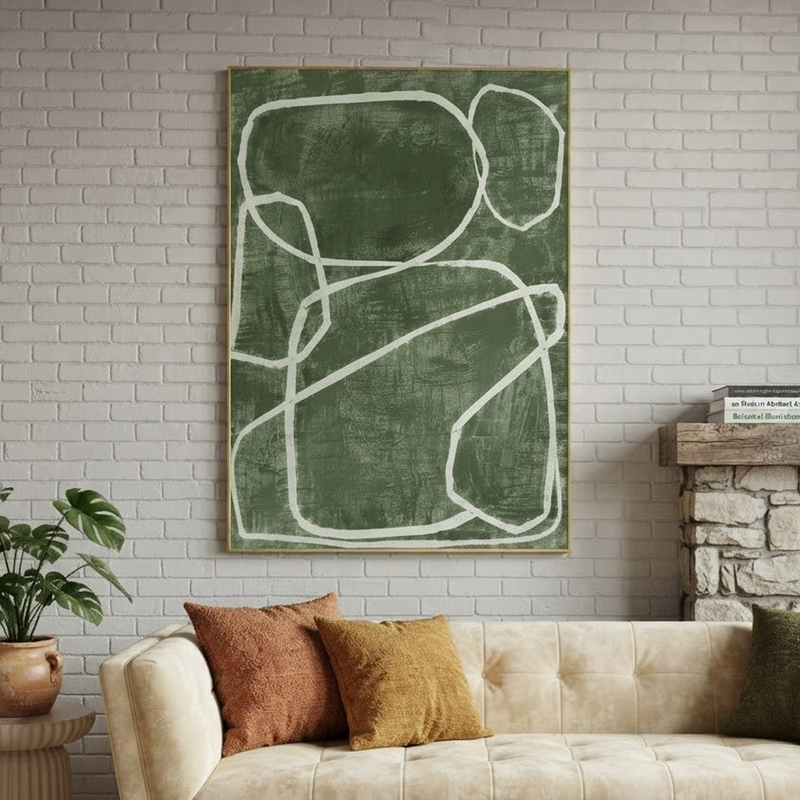
15. Real-World Examples: How People Use It
These are illustrative scenarios based on common design approaches, not customer testimonials.
The small apartment living room
A renter with white walls and a grey sofa hangs one large warm-greige piece above the couch. Nothing else on the wall. The room reads as calmer and more finished, and the piece travels easily when they move.
The bedroom that felt too busy
A couple swaps a loud gallery wall for a Set of 2 in soft neutrals above the bed. With less visual noise, the room feels restful, and the texture adds a little warmth to the headboard wall.
The home office that felt sterile
A remote worker adds a mid-sized textured piece beside the desk, lit by a warm lamp. It gives the eye somewhere gentle to rest during breaks, without distracting from work.
The gift
Someone buying for a friend who loves minimalist design chooses a wabi sabi piece in beige tones. It is personal without being risky, because the palette suits almost any home.
16. Does Wabi Sabi Art Really Make a Home Feel Calmer?
Many people say so, and it makes sense. Muted colors, uncluttered composition and natural textures all reduce visual noise, and a piece that you enjoy looking at can make a room more pleasant to spend time in. The philosophy itself also nudges you toward noticing and accepting imperfection, which can shape how you approach your space.
That said, it is worth being honest. Art is a lovely addition to a home, but it is not a treatment for stress, anxiety or any health condition. If you are struggling with your wellbeing, please speak with a qualified healthcare professional. Think of wabi sabi art as one gentle ingredient in a space that helps you feel at ease, not a cure.
Conclusion: Choose Art That Feels Lived-In
Wabi sabi art is not about chasing perfection. It is about choosing pieces with character, made by hand from natural materials, that grow more interesting with time. To recap:
- Wabi sabi finds beauty in imperfection, impermanence and simplicity.
- Textured, handmade pieces bring depth and originality that prints cannot match.
- Size, light and placement matter as much as the artwork itself.
- Care is simple: keep it dry, dust gently and let it age gracefully.
- Use it as one calm element in a thoughtful space, not a cure-all.
Ready to find your piece? Browse the collection and see what fits your wall.
Shop wabi sabi wall art Explore 3D plaster art Ask about custom sizes
Frequently Asked Questions
1. What is wabi sabi art in simple terms?
Wabi sabi art celebrates imperfection, natural texture and the passage of time. It usually features muted earthy colors, handmade surfaces and organic, asymmetrical forms. Instead of looking flawless, it looks honest and lived-in, which is why it feels so calming in a home.
2. Is wabi sabi wall art a good fit for a small room?
Yes. Its quiet palette and tactile depth add interest without clutter. In a small room, choose one well-sized piece rather than many small ones, and keep the surrounding decor simple so the texture can stand out.
3. How do I clean textured plaster wall art?
Dust gently with a soft, dry cloth. Keep the piece away from moisture and humid rooms, and avoid harsh cleaning products or wet wiping on textured surfaces. If you are unsure about a specific piece, check with the seller.
4. Will cracks or uneven edges in handmade art be a problem?
Small variations, subtle texture changes and uneven edges are a normal part of handmade wabi sabi work and reflect how natural materials cure. If you are unsure whether something is intended, contact the seller before or after purchase, and check the return window.
5. Can I order a custom size or color palette?
Many Artiquo pieces can be adapted to specific wall dimensions or color needs. Visit the customization page or contact the team to discuss your space.
References and Further Reading
- Wabi-sabi (overview), Wikipedia
- Japanese Aesthetics, Stanford Encyclopedia of Philosophy
- Leonard Koren, Wabi-Sabi for Artists, Designers, Poets and Philosophers (Stone Bridge Press, 1994)
- Andrew Juniper, Wabi Sabi: The Japanese Art of Impermanence (Tuttle Publishing)