

Explore Wabisabi Art — Original & Handcrafted

What Is Wabi Sabi Art?
Wabi sabi art is artwork rooted in the Japanese aesthetic of finding beauty in imperfection, simplicity, and the natural passing of time. In practice, that usually means muted earthy colors, uneven textures, visible brushwork or plaster marks, and surfaces that look touched by hands rather than machines.
Think of it this way. A factory-printed canvas is like a perfectly pressed white shirt. Wabi sabi art is more like your favorite linen one, softened by wear, slightly wrinkled, and better for it.
The term combines two ideas. Wabi points to rustic simplicity and a quiet, humble kind of beauty. Sabi refers to the patina that comes with age, like weathered wood or a chipped ceramic bowl. Put them together and you get art that doesn't try to look new or flawless.
Here's a quick snapshot:
- Colors: soft whites, sandy taupes, warm greys, muted ochres, charcoal
- Textures: lime plaster, raw canvas, clay, sand, layered pigment
- Shapes: asymmetrical, organic, unforced
- Mood: calm, grounded, unhurried
- Best for: homes that want warmth and atmosphere over decoration for its own sake
You may also hear it called textured wall art, organic art, or plaster art. The labels overlap, but the thread running through all of them is the same: the piece feels alive, not manufactured.
The Philosophy Behind Wabi Sabi: Why Imperfection Feels So Good
Wabi sabi grew out of Japanese tea culture, where masters like Sen no Rikyū favored humble, handmade bowls over flashy imported ones. The idea was radical for its time. A rough, irregular cup could be more beautiful than a flawless one because it carried evidence of the person who made it.
Three quiet principles sit underneath the whole philosophy:
- Nothing lasts. Surfaces fade, crack, and soften, and that's part of their charm.
- Nothing is finished. Every object is always becoming something slightly different.
- Nothing is perfect. Flaws aren't errors to hide, they're the signature of the material.
If you've ever seen kintsugi, the practice of repairing broken pottery with gold lacquer, you've already met the same spirit. The crack isn't concealed. It becomes the most interesting part of the object.
For a wall in your home, this matters more than you might expect. Think about a room full of symmetrical, glossy, matching décor. It can look great in a catalog, but it rarely feels restful. Wabi sabi pieces do the opposite. A soft plaster surface that catches morning light, or a brushstroke that trails off unevenly, gives your eyes somewhere to rest.
For a deeper read on the source ideas, Leonard Koren's short book Wabi-Sabi for Artists, Designers, Poets & Philosophers is still one of the clearest introductions available in English.
Why Handcrafted, Original Art Matters
Let's be honest about something. Plenty of wall art that looks "textured" online is actually a flat print of a textured image. It photographs well, then arrives smooth as a placemat.
Handcrafted work is a different animal. When a piece is built by hand, three things happen that a printer simply can't reproduce:
- Real dimension. Plaster ridges and layered pigment cast tiny shadows that shift through the day.
- True uniqueness. A brushstroke made today won't be made the same way tomorrow, so no two pieces match exactly.
- Material honesty. Natural materials cure, settle, and crack in their own rhythm, which is exactly what the wabi sabi philosophy celebrates.
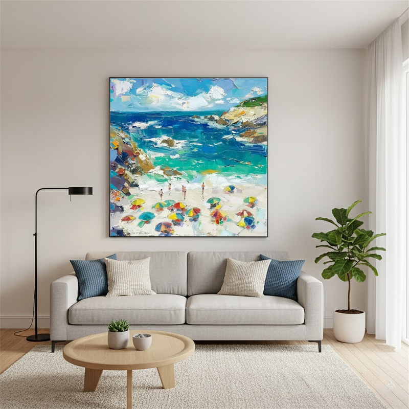
Here's a simple comparison you can use when shopping:
| Feature | Handcrafted original | Printed reproduction |
|---|---|---|
| Surface | Physically layered and tactile | Flat, or a thin faux-texture coating |
| Uniqueness | One of a kind | Identical copies exist |
| Light behavior | Shifts with the time of day | Static |
| Aging | Develops character | Can fade or look dated |
| Story | Made by a person, with intention | Made by a process |
Neither is "wrong," and prints have their place. But if your goal is a wall that feels personal and grounded, an original piece does something a reproduction can't. It gives the room a presence you can almost feel when you walk past it.
Materials and Techniques: What Wabi Sabi Art Is Actually Made Of
Ever wondered why some art seems to glow softly instead of shouting? Much of the answer is in the materials.
Handcrafted wabi sabi pieces typically start with a carefully chosen base and build upward in layers:
- Raw canvas gives an honest, slightly irregular foundation.
- Lime plaster creates that soft, stone-like surface with subtle ridges and hairline textures.
- Natural pigments produce chalky, muted colors instead of glossy, saturated ones.
- Clay and sand add grit and tooth, so the surface reads as earthy rather than polished.
The technique matters as much as the ingredients. Layers are built slowly, then added to, scraped back, and reshaped by hand. Pigments are mixed in small batches, so even a "warm white" can shift slightly from one piece to the next. That's not inconsistency. It's the natural result of working with real materials instead of a factory formula.
There's a practical upside, too. Because these materials are chosen for how they age as much as how they look, the art doesn't feel like it has an expiration date. A trend-driven neon print might feel tired in two years. A plaster piece in soft taupe tends to settle into a room, the way a good wooden table does.
One care note worth remembering: textured plaster surfaces prefer dry conditions. Keep them away from moisture and high-humidity spots, and dust gently with a soft, dry cloth.
Wabi Sabi vs. Minimalist vs. Abstract Art: What's the Difference?
These three styles get lumped together constantly, and for good reason. They share a love of restraint. But they aren't the same thing, and knowing the difference helps you choose with confidence.
Minimalist art is about reduction. Clean lines, limited elements, often crisp edges. It's precise and controlled.
Abstract art is about interpretation. It doesn't depict a recognizable subject, so you bring your own mood and meaning to it.
Wabi sabi art is about acceptance. It embraces roughness, asymmetry, and the marks of time, usually through natural textures and earthy palettes.
| Style | Core idea | Typical look | Feels like |
|---|---|---|---|
| Minimalist | Less, but exact | Clean edges, sparse color | Ordered, crisp |
| Abstract | Open to interpretation | Color fields, layered strokes | Expressive, personal |
| Wabi sabi | Beauty in imperfection | Raw texture, muted earth tones | Calm, grounded |
The good news is they blend beautifully. A textured wabi sabi piece with soft abstract brushwork can sit comfortably in a Japandi, Scandinavian, or organic modern room. Many homes end up using all three ideas at once without even planning to.
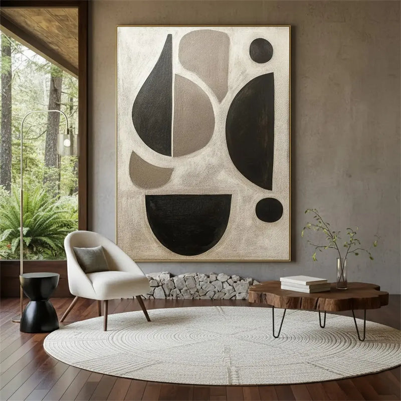
Explore more: Wabi Sabi Art collection · Abstract Art · 3D Plaster Art
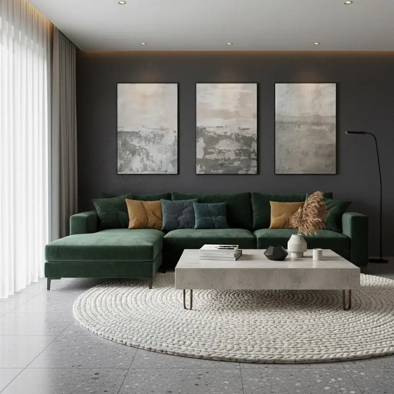
Where to Hang Wabi Sabi Art: Room-by-Room Ideas
A blank wall isn't just empty space. It's the biggest decision in a room that you haven't made yet. The trick with wabi sabi art is matching its quiet energy to what each room is for.
- Living room: This is the classic spot. Hang a large textured piece above the sofa or a media console. It softens the hard edges of modern furniture and gives guests a natural place to look when conversation slows.
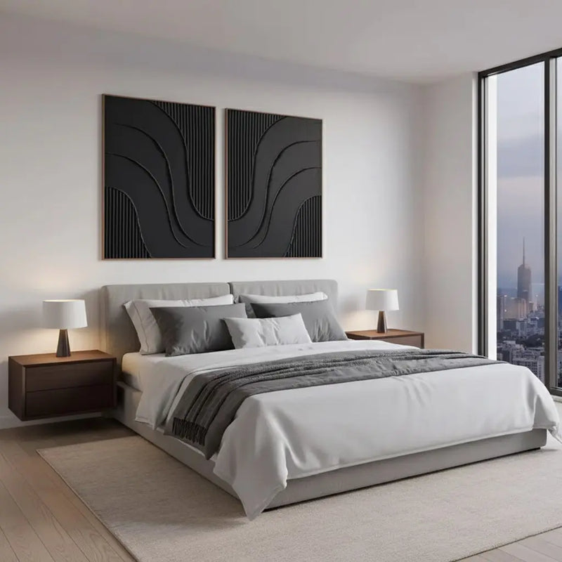
- Bedroom: Go for something low-contrast and gentle above the headboard. The goal is stillness, so avoid anything with busy patterns or sharp color jumps.
- Entryway: You get about five seconds to make a first impression here. A single textured piece across from the door tells people what kind of home they've walked into: calm, considered, lived-in.
- Home office: Many offices feel sterile. Earthy plaster tones behind your monitor add warmth and depth without pulling your eyes away from work.
- Dining space: Choose something with visible layering. Meals last a while, and people notice the details of a wall when they're seated for an hour.
Picture a narrow hallway that currently feels like a tunnel. One tall, vertical piece in sandy taupe at the far end gives the eye a destination and makes the space feel intentional. That's the sort of small shift wabi sabi art does well.
One caution: skip steamy bathrooms and kitchens right above the stove. Plaster and natural pigments prefer dry, stable air.
How to Choose the Right Size and Scale
Most people buy art that's too small. It's the single most common mistake in wall styling, and it makes a room look like the art was an afterthought.
A widely used designer guideline is that art above furniture should span roughly two-thirds to three-quarters of the furniture's width. So over a 90-inch sofa, you're looking at a piece (or a grouped set) somewhere around 60 to 68 inches wide. Another common rule is to hang the center of the piece at about 57 inches from the floor, which is roughly average eye level. Treat both as starting points, not laws.
| Space | Suggested approach |
|---|---|
| Above a sofa or bed | One large piece, or a tight pair, about 2/3 to 3/4 of the furniture width |
| Console or entry table | A medium piece, leaving a few inches of breathing room on each side |
| Narrow hallway | Tall vertical piece, or a small gallery arrangement |
| Reading nook | Small, intimate piece at seated eye level |
| Large open wall | Oversized statement piece, or a triptych with even spacing |
When in doubt, size up. A large textured piece has more impact than three small ones because texture needs surface area to show off. Small works can absolutely be lovely, but they tend to work best in clusters, where you leave 2 to 3 inches between frames or panels so they read as one composition.
Before you buy, try this: cut a piece of kraft paper or painter's tape to the dimensions you're considering and stick it on the wall for a day. You'll know quickly whether it feels right.
Color and Palette: Matching Earthy Tones to Your Home
Wabi sabi palettes borrow from the ground, the sky on a foggy morning, and old stone. That's why they're forgiving. Muted tones rarely fight with the other colors in your space.
| Palette | Pairs well with | Mood it creates |
|---|---|---|
| Soft white and cream | Light oak, white linen, pale walls | Airy, serene |
| Warm grey | Charcoal sofas, black metal accents | Balanced, contemporary |
| Sandy taupe | Walnut, rattan, cream upholstery | Warm, welcoming |
| Muted ochre | Terracotta, dark wood, olive greens | Earthy, grounded |
| Deep charcoal | Light walls, brass or bone accents | Dramatic, architectural |
Here's a practical way to pick. Look around your room and identify the one color you see the most, usually your wall or your largest furniture piece. Then choose art that either matches it in a different tone (a tonal look) or sits one step warmer or cooler (a gentle contrast).
Don't worry about matching everything exactly. Because pigments in handcrafted work are mixed in small batches, each piece has slight variations built in, and that natural irregularity is what stops a room from looking staged.
If you have strong feelings about a particular shade, it's worth asking whether custom palettes are available for the piece you love. Many handcrafted artists can adapt a color to suit a specific space.
Light, Texture, and Styling: Making the Art Come Alive
Here's something photos can't fully show you. Textured art changes throughout the day.
In the morning, soft light from a window slides across plaster ridges and casts long, gentle shadows. By afternoon, the same surface looks flatter and calmer. At night, a warm lamp turns those same ridges into a subtle relief. That's a big part of why handcrafted pieces feel alive rather than static.
A few simple ways to help it along:
- Use side light, not head-on light. Light that skims across a surface (from a window or a wall sconce to one side) reveals texture better than a spotlight pointing straight at it.
- Choose warm bulbs. A warm white tone around 2700K flatters earthy pigments. Cool white bulbs can make them look chalky.
- Layer with natural materials. Wood, linen, ceramic, stone, and dried botanicals echo the art without copying it.
- Leave breathing room. Wabi sabi is about space as much as objects. Don't crowd the wall with shelves and frames.
- Mind the environment. Keep pieces out of direct moisture and harsh sun over long periods.
Picture a console table with a handmade ceramic bowl, a single stem in a small vase, and a textured piece hung above. Three or four thoughtful elements beat fifteen decorative ones every time.
Wabi Sabi Art Across Interior Styles
One reason this style has stayed popular is its flexibility. It doesn't demand a full room makeover. It slots into what you already own.
- Japandi: A natural fit. Japandi blends Japanese restraint with Scandinavian warmth, and wabi sabi pieces sit right at the intersection. Pair them with low wooden furniture and clean lines.
- Scandinavian: Bright, light-filled rooms benefit from a textured piece in soft whites and greys, which adds depth without darkening the space.
- Organic modern: Curved furniture, bouclé, and raw wood already speak the same language. A plaster-based piece feels like it belongs.
- Contemporary: If your space is sleek, a wabi sabi piece adds the warmth and human touch that polished surfaces sometimes lack.
- Traditional or eclectic: Muted, earthy art can calm a busy room and give the eye a place to rest among patterns and antiques.
The takeaway? You don't have to commit to a label. If a piece makes you feel calmer when you walk past it, and it suits the tones in your room, it works. Style rules are useful starting points, but your own reaction to a piece matters more than any category.
Explore more: White Minimalist · Beige & Brown Minimalist · Customization

The Mistakes I See Buyers Make Most Often
After fifteen years of working with handmade art and helping people dress their walls, I can tell you the same handful of mistakes come up again and again. The good news is that every one of them is easy to avoid once you know what to look for.
- Buying to match the cushions. People hold a swatch up to a throw pillow and pick art in that exact shade. Pillows change. Choose art for the room's mood and its dominant tone, not for an accessory you'll replace in two years.
- Going too small. A modest piece floating over a large sofa looks like a postage stamp on an envelope. Size up, and use the two-thirds guideline from earlier as your starting point.
- Hanging too high. Most walls I visit have art hung near the ceiling. The center should sit around eye level, roughly 57 inches from the floor.
- Judging only on a screen. Textured work behaves differently in real light. Read the description carefully, look at the close-ups, and think about which direction your window faces.
- Crowding the wall. Wabi sabi needs empty space around it. If you surround it with shelves, frames, and mirrors, you drown out the very thing that makes it special.
- Expecting perfection from a handmade piece. A small variation from the listing photo isn't a defect. It's the reason you chose handmade in the first place.
If you take only one thing from this section, let it be this: buy the piece that makes you pause when you walk past it, then work out the rest.
Sets and Gallery Arrangements: Getting the Rhythm Right
Sets of two or three are one of my favorite tools, especially for wide walls that a single canvas can't cover. Done well, they read as one calm composition. Done badly, they look like three strangers who happened to arrive at the same party.

Here's how I approach it:
| Arrangement | Works best for | Practical tip |
|---|---|---|
| Set of 2 | Above a console, a narrow sofa, or a bed with limited width | Keep 2 to 3 inches between panels so they read as a pair |
| Set of 3 (triptych) | Wide walls over sofas, dining areas, long hallways | Align the centers, not just the tops, and keep the gaps even |
| Single oversized piece | Feature walls, entryways | Give it generous space on every side |
| Mixed sizes | Stairwells, relaxed gallery walls | Repeat one color from piece to piece to tie them together |
Two habits will save you a lot of frustration. First, lay everything out on the floor before you hang a single nail. Second, trace each piece on kraft paper, tape the paper to the wall, and step back. You'll spot spacing problems in seconds instead of after drilling.
If you'd like to see how this looks in practice, browse the Wabi Sabi Wall Art Set of 3 #PB250 and the Wabi Sabi Wall Art Set of 2 #PB249 for real examples of paired and tripled compositions.
How to Tell Genuine Handcrafted Art from a Convincing Imitation
This is where experience really counts. The market is full of pieces described as "textured" or "handmade" that are, on closer inspection, flat prints with a clear coating. I don't say that to be cynical. I say it because a little knowledge protects your budget.
Start with what a real handcrafted piece tends to show you:
| Signal of real craft | Red flag |
|---|---|
| Photos show close-ups of brushwork or surface depth | Only glossy, wide-angle room scenes |
| Materials are named specifically | Vague words like "premium" with no detail |
| Description openly mentions natural variation | Promises that every piece matches the photo exactly |
| Clear information on sizing, shipping, and returns | Hidden or confusing policies |
| Seller answers questions with specifics | Generic replies that skip your question |
Then ask direct questions before you buy. What is the surface made from? Is the texture built up by hand or printed? Is the piece signed? How does the seller handle a piece that arrives damaged?
One honest caveat. Even the most careful handmade work will differ slightly from its listing photo, so read that as a sign of authenticity, not a warning. What you're really looking for is transparency, not sameness. A seller who explains their process and their limits is usually one you can trust.
Caring for Textured Wall Art So It Ages Well
Wabi sabi art is meant to age gracefully, but graceful aging still benefits from a little care. Here's what I tell everyone who takes a piece home.

- Hang it properly. Use hardware rated for the piece's weight, and get a second person to help with anything large. A fall damages both the art and the wall.
- Dust gently. A soft, dry cloth or a clean, dry brush is enough. Skip sprays, damp cloths, and household cleaners, which can mark or dull natural surfaces.
- Control moisture. Keep pieces out of steamy bathrooms and away from kitchen cooktops. Stable, dry air is what natural materials like this prefer.
- Manage the sun. Prolonged direct sunlight can fade pigments over the years. If a wall gets harsh afternoon light, consider a sheer curtain.
- Avoid heat sources. Radiators, vents, and fireplaces cause uneven drying and stress.
- Move and store with care. Keep the piece upright, wrap it in a breathable cloth instead of plastic, and never stack heavy items against it.
You may notice fine hairline changes in plaster-based surfaces over time. That's normal behavior for the material, and it's part of the character. If you ever see something that concerns you, such as flaking or a sudden change, contact the seller and send clear photos.
What You're Really Paying For: Budget, Value, and Realistic Expectations
Let's talk money, because it's the question behind every purchase. When you buy an original handcrafted piece, you're paying for time, skilled labor, quality materials, and the fact that nobody else will have exactly the same one. That's a different proposition from buying a mass-produced print, and it's fair to expect a different price.
A few principles I've found useful:
- Spend where it shows. Put most of your budget toward the largest, most visible wall. That single decision does more for a room than several small purchases.
- Think in years, not weeks. A piece you'll live with for a decade costs very little per year of enjoyment.
- Read the fine print. Check the return, shipping, and damage policies on the seller's own policy pages before you order. ArtiQuo states a 30-day window after delivery, but always confirm the current terms yourself.
- Ask about customization. If you need a specific size or palette, ask the seller. Many can adapt a piece, and that's often better value than compromising on a stock size.
- Don't buy purely for the discount. A sale is nice, but the wall is yours to look at every day. Buy the piece you love.
A quick word of caution: I'd never promise that a decorative piece will rise in value. Treat wall art as something you buy for daily enjoyment, and consider anything beyond that a bonus. This is general information, not financial advice.
Explore more: Wabi Sabi Art collection · Customization · Refund & Return Policy

Three Real-World Scenarios: Matching Art to the Room
Theory only gets you so far, so let me walk through three situations I see constantly. These are typical scenarios rather than case studies, but the logic carries over to almost any home.
The compact apartment living room. The wall above the sofa is roughly ten feet wide, the sofa is about 80 inches long, and there's very little visual breathing room. The instinct is to hang three small frames. I'd steer you toward one large piece, or a tight set of two, spanning roughly 55 to 60 inches. Choose a soft, tonal palette close to your wall color so the room feels bigger, not busier. The texture does the talking.
The bedroom. Here, the job is to lower the room's noise level. Hang a low-contrast piece centered above the headboard, use a warm 2700K bulb in the bedside lamps, and keep everything nearby simple. One pair of panels in warm greys or sandy taupes gives you symmetry without stiffness. You want your eyes to relax the moment you walk in.
The home office. More of us work on camera now, and what sits behind your chair says something about you. A textured neutral piece behind the desk looks polished on video and calming in person. Position lamps so they graze the surface from the side instead of glaring straight at it, otherwise the camera flattens the texture you paid for.
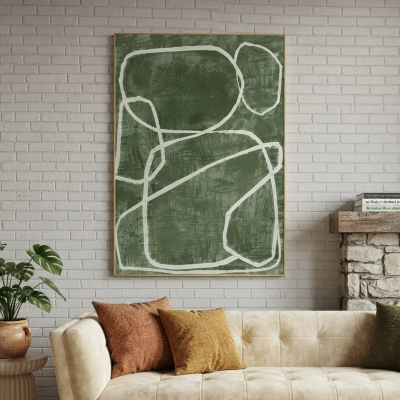
Notice the pattern across all three: measure first, respect the light, keep the palette quiet, and let one strong piece lead. That formula rarely fails.
A Simple Checklist Before You Buy
Quick answer: to buy wabi sabi art with confidence, measure your wall, note your light, choose a dominant tone, decide between a single piece or a set, then check materials and policies before you order.
Here's the sequence I walk people through:
- Measure the wall and the furniture beneath it. Write down both widths, and the distance from floor to the spot where the piece will hang.
- Watch the light for a day. Note where the sun lands in the morning and afternoon, and where your lamps sit at night.
- Name your dominant tone. Look for the color you see most, then decide whether you want a tonal match or a gentle contrast.
- Choose a format. One statement piece, a pair, or a triptych each suit different walls.
- Read the details. Check materials, care instructions, shipping, and return terms on the seller's own pages.
- Tape it out. Use kraft paper or painter's tape to mark the size on the wall for a day or two.
- Hang at eye level. Aim for the center of the piece at about 57 inches, then step back and adjust.
That's the whole process. It takes an afternoon, and it prevents most of the regret I hear about.
Final Thoughts: Let the Wall Breathe
Wabi sabi art asks something unusual of us: to stop chasing flawless and start noticing what's real. We've seen that the style grows from tea-house humility, that handcrafted texture behaves differently from a printed surface, and that materials like plaster, natural pigment, and canvas age with character instead of against it.
We've also covered the practical side. Size up, hang at eye level, respect the light, keep your palette quiet, and give the piece room. Ask honest questions about how it's made, care for it gently, and set realistic expectations about value.
If there's one idea to carry with you, it's this. A room doesn't need more things. It needs the right few things, chosen with intention. When you're ready, explore the Wabi Sabi Art collection and see which piece stops you in your tracks.
Frequently Asked Questions
Is wabi sabi art the same as minimalist art?
Not quite. Minimalist art is about reduction and precision, with crisp edges and very little content. Wabi sabi art is about acceptance, so it welcomes roughness, asymmetry, and visible texture. They share a calm mood and pair well together, but wabi sabi pieces feel warmer and more organic because the marks of the maker and the material stay visible.
What colors work best for wabi sabi wall art?
Earthy, muted tones are the safest bet: soft whites, cream, sandy taupe, warm grey, muted ochre, and deep charcoal. They borrow from stone, clay, and weathered wood, so they sit comfortably beside natural materials. To choose, find the most dominant color in your room and select art that either matches it in a different tone or sits one step warmer or cooler.
How do I hang and care for textured wall art?
Hang it with hardware rated for its weight, get help with large pieces, and center it at roughly 57 inches from the floor. Dust with a soft, dry cloth or brush, and avoid sprays or damp cloths. Keep it away from steam, heat sources, and long stretches of direct sun. Small hairline changes in plaster surfaces are normal over time.
Can I get wabi sabi art in a custom size or color?
Often, yes, but it depends on the seller and the piece. ArtiQuo has a Customization page, so start there or contact the support team with your dimensions and preferred palette. Sharing a photo of the wall and a note about your lighting helps the artist suggest something that suits the space.
How can I tell whether a piece is truly handcrafted?
Look for close-up photos that show real surface depth, specific descriptions of materials, and honest mention of natural variation. Be cautious of vague wording, only glossy room scenes, and unclear return policies. Before buying, ask what the surface is made from, whether the texture is built by hand, and how damaged deliveries are handled.
Please don't forget to leave a review.
References and further reading
- Koren, Leonard. Wabi-Sabi for Artists, Designers, Poets & Philosophers. Stone Bridge Press, 1994.
- Stanford Encyclopedia of Philosophy, "Japanese Aesthetics": plato.stanford.edu/entries/japanese-aesthetics/
Explore more: Shop Wabi Sabi Art · Customization · Set of 3 #PB250 · Set of 2 #PB249